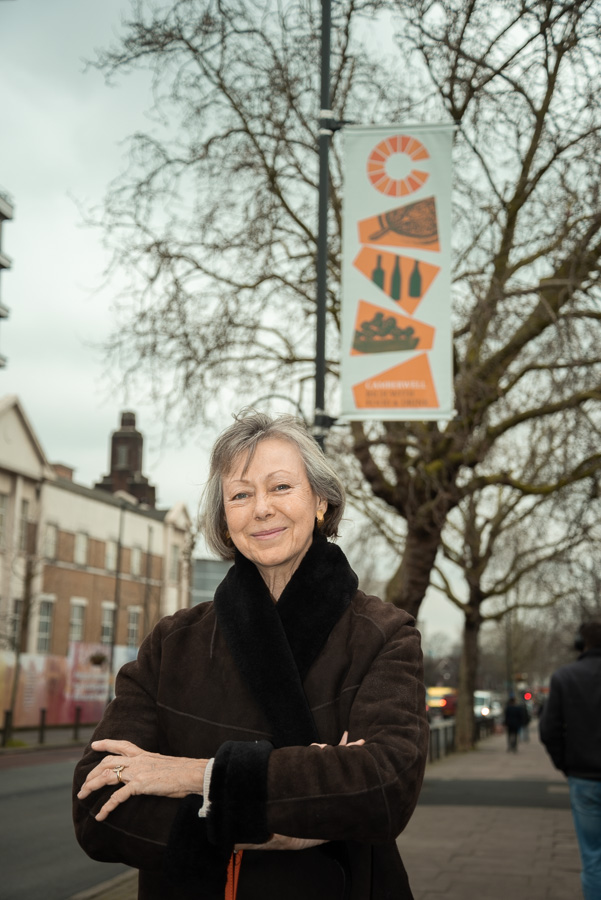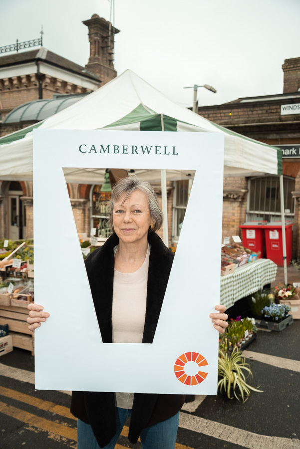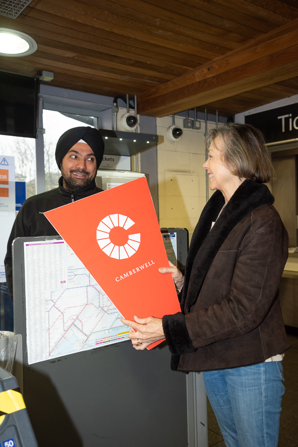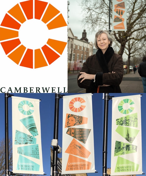
Camberwell branding and banners launched by actress Jenny Agutter
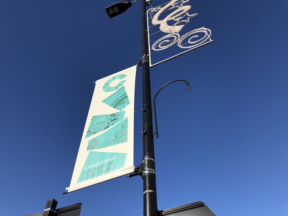
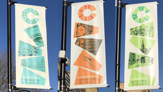
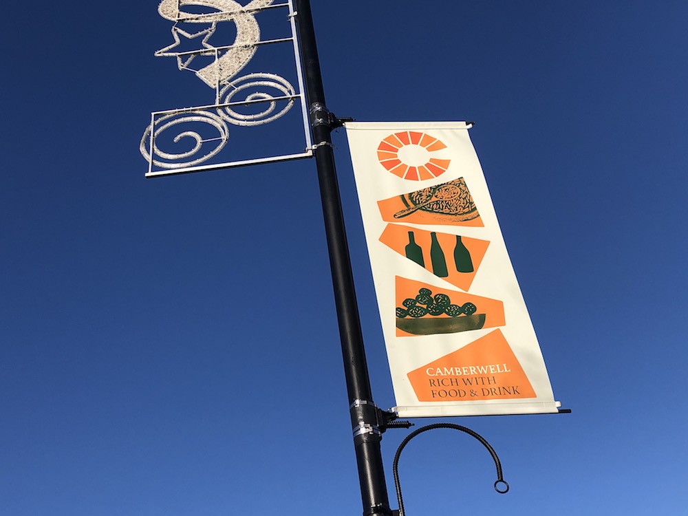
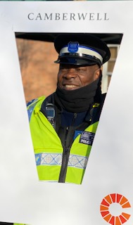
The ‘Camberwell Brick’ branding design has been unveiled, with strong cultural and historical significance. The colourful design is featured on the new crowdfunded Camberwell Banners along Denmark Hill to reflect the diversity and vibrancy of the area.
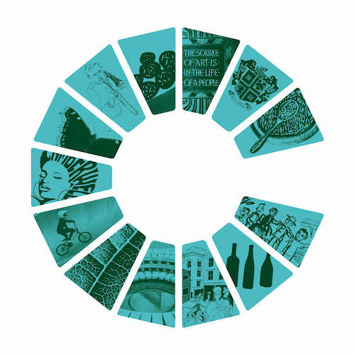
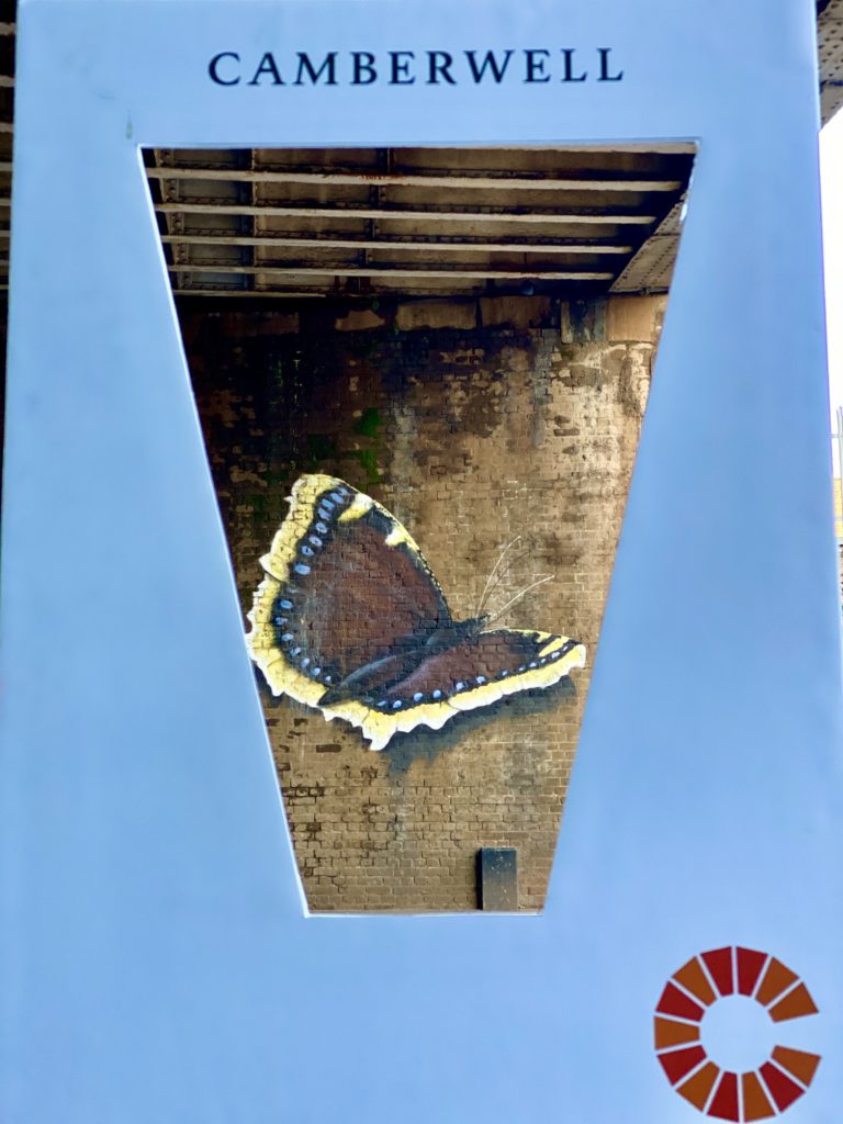
The ‘Camberwell Brick’, created by local design consultancy Studio Sutherland, who have designed identities for the Natural History Museum, Pallant House Gallery and Kings Place, was inspired by the well which features in the area’s name, history and coat of arms. The well acts as a metaphor for Camberwell’s diverse and vibrant community, with each brick able to symbolise different characteristics that come together to make a cohesive whole. The bricks also form the C for Camberwell.
Camberwell-resident Jenny Agutter, currently starring in Call the Midwife, says: “Camberwell is a real neighbourhood; its strong cultural mix and rich history are what make it a great place to live. Using the Camberwell Brick on the banners and other projects will enable us to bring the story of Camberwell’s vibrancy to life, making everyone feel proud of what we have here in SE5.”
The visual branding was commissioned by the Camberwell Identity Group, following research which showed people felt Camberwell can often be overlooked, and its identity overshadowed by the surrounding areas of Peckham, Brixton and Dulwich. The group of volunteers recognised the need to create a sense of place for Camberwell; one which brings the community together, creates more business for local traders and a Camberwell for everyone to be proud of.
“Working closely with our chosen designer, Studio Sutherland, and through on-going community consultations, we have created branding which can show the many reasons Camberwell is a great place to live and work, such as its diversity, green spaces, food & drink and community,” says Jessica Bishop, Chair, Camberwell Identity Group. “We are delighted with the ‘Camberwell Brick’; it provides us with a distinctive and relevant space to own, enabling us to tell the story of Camberwell brick by brick. It will be used to signpost and raise awareness of Camberwell and enhance the look of the area.”
The branding, which uses a palette of colours drawn from local greenery, architecture and the sky, and a typeface created by local typographer Berthold Wolpe, was unveiled today on lamppost banners positioned along Denmark Hill.
The banner themes are based on locals’ favourite aspects of Camberwell which are community, creativity, health, green spaces, businesses and food and drink and the visuals used are by local artists and photographers.
The aim of the banners is to encourage the millions of people that come every year to visit its world-famous hospitals to see more of Camberwell, leading them down the high street to discover the wonderful cafes, shops, green spaces and galleries of Camberwell.
Local business owner Ross Farmer from Support & Sustain, who was consulted on the brand development, says: “the ‘Camberwell Brick’ introduces a consistent and highly visible branding that unites all the different elements that make Camberwell great. The lamppost banners create immediate impact and bring life into the high street which will hopefully boost the local economy by attracting new visitors and customers into Camberwell.”
The Camberwell Identity Group has developed guidelines for all stakeholders, which will allow the brand to work consistently. This will include a bank of imagery donated by local people, artists and photographers. The Group has an open call-out to residents of Camberwell to submit their visuals that they would like to make available for use.
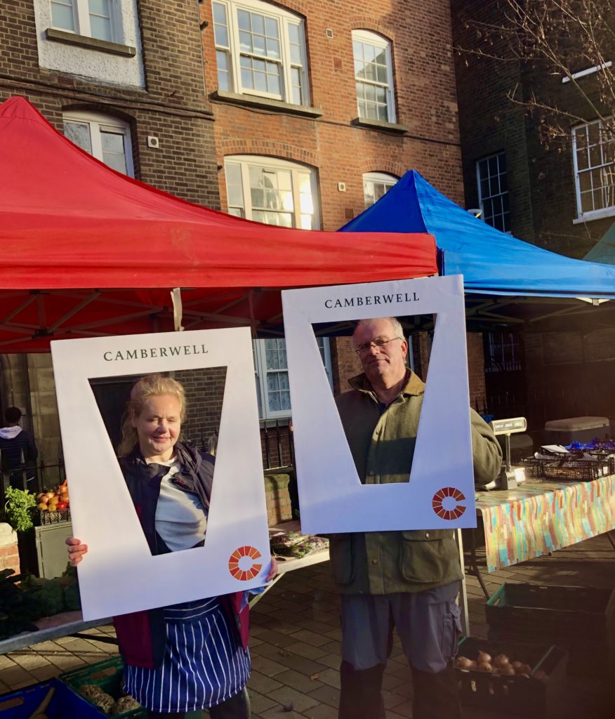
The banners are just the beginning. The Group is in talks with local businesses and organisations, Network Rail and Southwark Council about using the identity, they are looking for a local maker to produce real bricks for use in development projects, and residents will also be encouraged to use and own the idea.
The money for Camberwell Banners was crowdfunded through Spacehive, with donations received from local businesses, community groups and Camberwell residents, and supported with matched funding of £6500 from the Mayor of London’s Crowdfund London scheme.
Camberwell Identity Group
The Camberwell identity group includes brand experts, artists, teachers, and representatives from local churches, mosques and estates. It consulted widely and commissioned local designers Sutherland Studio, whose award-winning portfolio includes the rebrand of the Natural History Museum, had experience of developing identities for geographical locations and also local understanding and connections, to develop the brand identity for Camberwell.
The Wolpe Collection Font
Camberwell even has its own font, thanks to Berthold Ludwig Wolpe – the visionary German-Jewish calligrapher, typographer, designer and illustrator who helped shape graphic design in post-war Europe. He designed the Albertus typeface which is used for many road signs in London.
Having escaped Nazi persecution in Germany in 1935, Wolpe moved to London where he created his legendary Albertus, Sachsenwald and Pegasus fonts for Monotype. In 1941 he joined Faber & Faber, where he designed many of their most beautiful and memorable book jackets over the course of three decades.
Wolpe went on to teach at Camberwell School of Art from 1948-53, as well as designing a masthead for The Times in 1966. He was made a Royal Designer for Industry in 1959, awarded an honorary doctorate by the Royal College of Art in 1968 and appointed an Officer of the Order of the British Empire (OBE) in 1983.
The Wolpe Collection, revived by type designer Toshi Omagari, brings together a restored set of his typefaces and reinvigorates the work of a man who was quietly instrumental in the world of British visual culture.

